Metro UI Design – Discovering a Completely New Design Concept
Let me tell you about my first experience in designing an app for Windows 8. As a web designer, I have always been interested in exploring new concepts and principles of designing different kinds of applications. Perhaps, someday I will invent my own approach for helping all the designers around the world in finding solutions for their various design questions.
Recently, the company I have been working for needed to create an application for the new operating system, Windows 8, and that is how I have discovered Metro UI Design. Of course, the first step in developing a Windows 8 application was to create a design using Metro UI Concept, which was proposed by Windows 8.

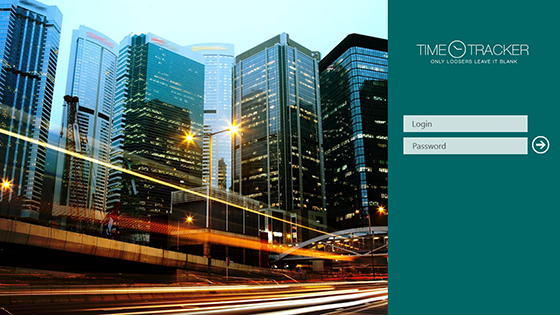
Design for the Login page
I remember my Team Leader has told me only one phrase: “In a week’s time, please, provide me with design mockups for our new application using Metro UI Concept”. That’s it! No additional information! For all of us, it has been a completely new experience in designing, as well as in coding and testing such kind of applications.
But I can definitely say that exploring this new concept of creating an application for Windows 8 hasn’t been as difficult or time-consuming as we had thought before, because the developers that had worked on Windows 8 did a very good job by making a very comprehensible system with clear rules and principles. Lots of tutorials and guidelines for Windows 8 are also available online and can be used for free which makes exploring Windows 8 easier.
New Approach in Creating Design for Time Tracking Application for Outsourcing companies
So, we began to explore this completely new approach for us. First, we started to think about creating a whole concept of our application. The most important task for us, as well as the biggest challenge, was to put all the elements of Time Tracker application in an understandable way for our users (companies who does outsource services in IT) by applying Metro Style. After creating the main concept for the whole application, we began to work on designing details for making our application usable and understandable.
We tried to make many different versions by putting elements in a different order, using different colour combinations, etc. But every time we tried a new version, we had a feeling that this would not work, and we had to make corrections over and over again.
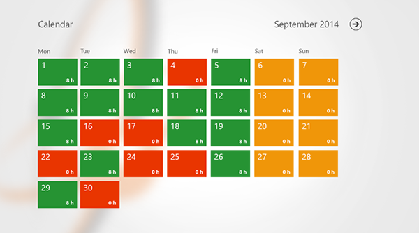
 Design for Windows 8 application – Calendar Light Grey Template
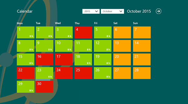
 Design for Windows 8 application – Calendar Dark Green Template
It was really tricky to design such pages as reports on the hours spent at work for every employee or to create pages with advanced search applying Metro Style. In some cases, we wanted to give up and not to use Metro Style, but now we can say that it has been a very useful fight for all of us. We have tried a lot of options of how we could put all the elements and make them readable and understandable using Metro Style. Below, you can see the process of our fight when designing this application.