3 Things You Need to Know About Accessibility
Our Team Lead Lauris Blīgzna talking about WEB Accessibility
Recently, I was asked: How do disabled people use the web? I have been working as a web developer for about four years, but I have never really thought about the usability of my web application for disabled people.
And that single question made me think: “Am I creating software that is available for everyone?”
What is WEB Accessibility and why is it important?

Web accessibility means making your content available to users with different skills and needs. More specifically, Web accessibility means that disabled people can comprehend, understand, navigate, interact and contribute to the Web. It also benefits others, including elderly people with changing abilities due to aging.
Millions of people have disabilities that affect their use of the Internet. Currently, most Web sites and Web software have accessibility barriers that make it difficult or impossible for many disabled people to use them. The more accessible Web sites and software become, the bigger number of disabled people are able to use and contribute to the World Wide Web and become more social.
A key principle of Web accessibility is designing Web sites and software that are flexible to meet different user odds and needs. This flexibility also benefits people without disabilities in certain situations, such as people using the slow Internet connection, people with injuries such as a broken arm, and people with changing abilities due to aging.
The power of the Web is in its universality
The Web is basically designed for everyone, regardless of what hardware or software you have, which language you speak, which culture you belong to, where you live or what your physical or mental ability is.
The web is an increasingly important resource in many aspects of life: education, employment, government, commerce, health care, recreation, etc. It is essential that the Web can be accessible in order to provide equal access and equal opportunity for disabled people.
The impact of disability is radically changed on the Web because the Web removes communication barriers and difficulties in interaction that many people face in the physical world. However, when websites, web technologies, or web tools are badly designed, they can create barriers that exclude people from using the Web.
Also, people are aging and it results in a number of accessibility issues, including vision and hearing changes, and declines in dexterity and memory.
Users
The web is used by millions of people and 20-30% of them are with different disabilities and needs.
Visually impaired users range from the colour blindness to full blindness. Without a text description, it is difficult for a blind user to understand what it is represented on the website. For colourblind users, it is also difficult to perceive design elements (including text) whose colours aren’t sufficiently different from the elements around them (e.g. background colours)
Hearing-impaired users are facing similar issues as visually impaired users. Hearing-impaired users may have difficulties in understanding what a video or audio record on the website says. A simple solution is to provide an alternative, such as a text description or an image.
Physical Disabilities: If you aren’t physically disabled, it might be hard to imagine how your online experience would look like if you were disabled. Now, try to use one of the websites you use every day without a mouse. How is it? I’ve tried it myself and it is hard. When you create Website navigation and inputs, physically disabled users may find your site completely impossible to navigate.
But that’s not all. Accessible Web can give advantages for other users, for example, users that access a website from a noisy environment (e.g., from a crowded cafe, etc.), with “screen glare”, with low literacy level etc.
How can you make your WEB more Accessible?
You may think that this is really hard, but the fact is that there are some simple steps that can greatly increase your website utility. There is also a hidden benefit of doing it: some of the techniques increase your SEO ratings.
Let me share these techniques with you:
1) Add a proper alt text to images
![]()
2) Use headings properly

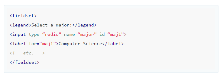
3) Add labels to form fields

4) Group related form fields together

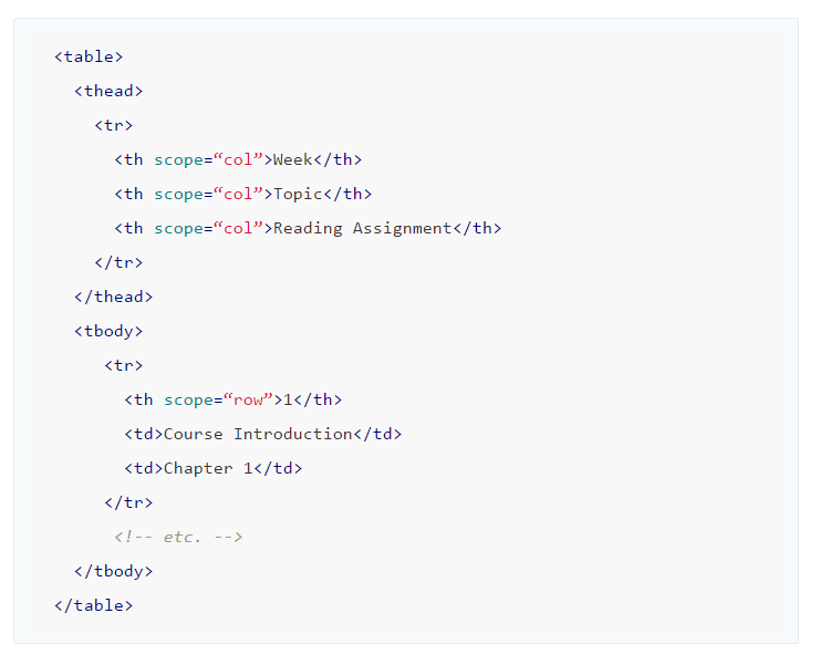
5) Markup tables appropriately
Include markup that clearly communicates the relationship between the table headers and the cells within their scope.

6) Identify the text language.
Identify the default language of a document:

7) Use a color contrast checker
8) Avoid using tiny fonts
9) Respect white space
Space between lines and space between paragraphs can help users who have difficulty tracking text horizontally. Contributes to a cleaner, more aesthetically pleasing interface for everyone.
10) Provide visible indication of focus – it is especially important for keyboard users.
11) Skip navigation
allows screen reader users and people who can’t use a mouse to skip long lists of links, such as the primary navigation on a website.
12) Turn of JavaScript and test your page.
Conclusion
As a developer, you should be aware that there are many users with different needs and abilities. It’s always good to be able to develop high-quality software. But it is especially valuable when you know how to develop software that can be used by everyone, regardless of what their needs and abilities are. It doesn’t take a long time to learn how to do it, but this knowledge will always be useful.
Start with the little things and in the end, it will become something big and meaningful.